Project
Meridian Identity
Our own mark: a word, a rule, and a promise not to redesign it when we're bored.
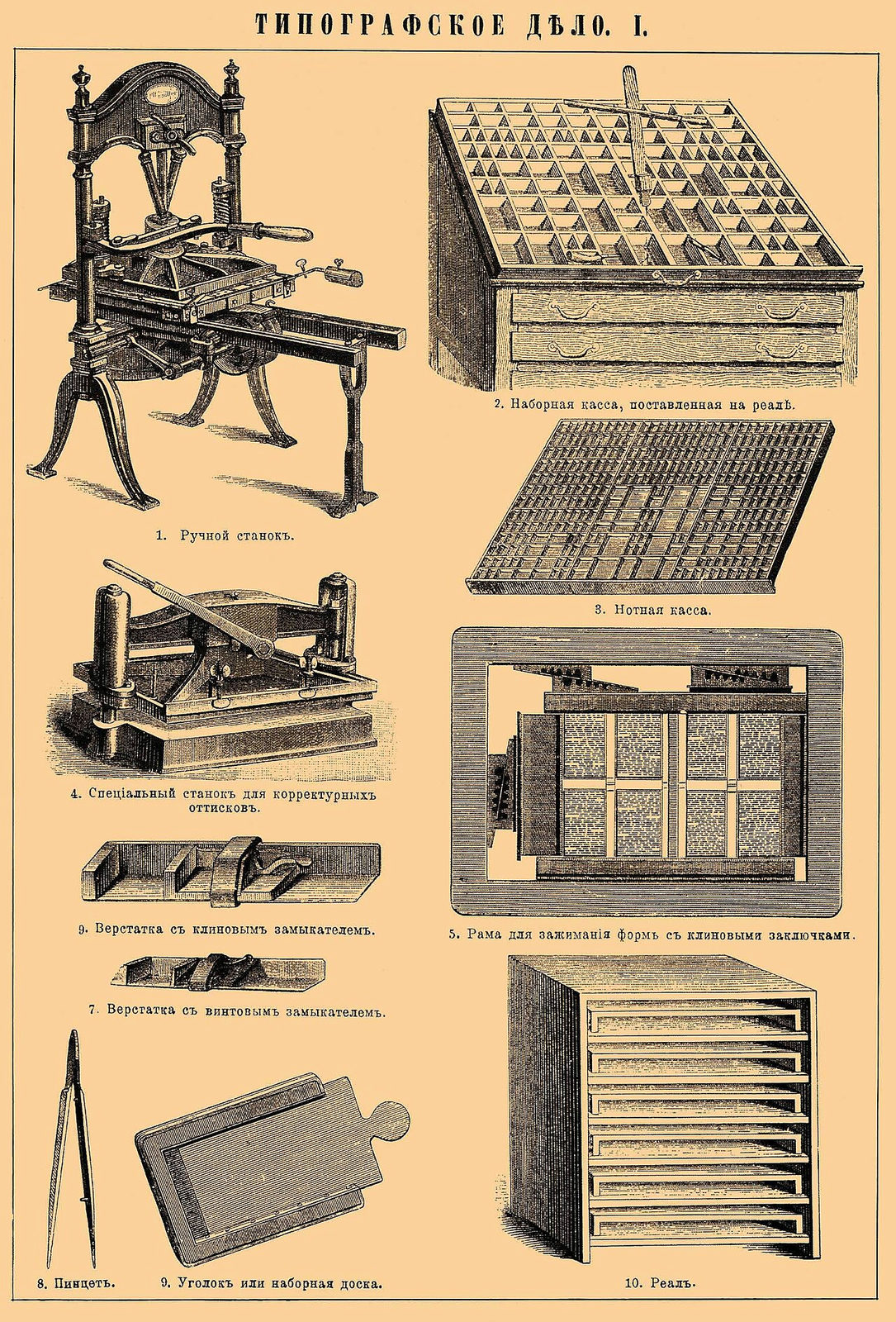
A studio identity is a client project with the worst client. We gave ourselves the same discipline we ask of others: one decision, held.
The mark is the studio name set in our text face with a single rule struck through the counter of the M — the meridian. It works at a stamp's size because it is a stamp: stationery is letterpressed from a single plate, and the digital mark is a scan of the impression, not a vector idealization of it. The identity's texture is the printing, not an effect.
Two colors (ink and paper), one face, no brand book. The restraint is the brand.